By the design team at The Display Boxes ·
What is a header card for?
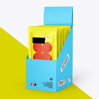
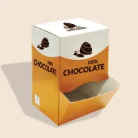
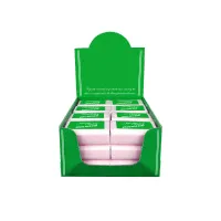
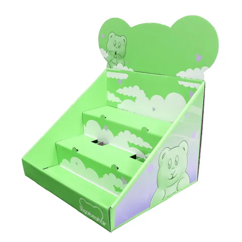
A header card is the raised panel at the back or top of a display. On a counter display it is often the lid folded back; on a stand it is the tall back panel; on a floor unit it is the sign at eye level; on a hanging pack it is the folded card stapled over a bag. In every case it does one job: to be noticed and understood from a distance, before the shopper has looked at a single pack.
That job is different from the job of your packaging. The pack is read in the hand. The header is read across a shop, often while the shopper is doing something else.
Because of that, the header is the one part of your display where less is almost always more. The best headers can be understood with a single glance.
How far away will people read it?
Further than you think. Someone in a queue is a metre or two from the counter. Someone walking down an aisle sees a floor unit from several metres. Someone scanning a peg wall sees dozens of cards at once. Design for the distance, not for your screen, where everything looks readable because it is a few centimetres from your eyes.
A simple test: print the header at full size, stick it on a wall and walk to the other side of the room. Whatever you cannot read from there, the shopper will not read either.
Try the test in the kind of light the shop has, too. A header that reads well on your desk can wash out under bright spotlights or disappear in a dim corner.
What should go on a header?
Less than you want to put on it. A header that works usually carries three things and no more.
- Your logo or brand name, large.
- What the product is, in plain words, if the logo does not say it.
- One reason to buy: a flavour, a benefit, an offer or a price where the shop allows it.
Everything else, from ingredients to your story, belongs on the pack. Shoppers who are interested will pick a pack up and read it.
If the shop allows a price, put it where it is easy to find but smaller than the logo, so the brand still leads.
How big should the logo be?
Big enough to read from the distance you worked out, and no smaller than about a third of the header width on a counter display. On stands and floor units, where the header is larger and further away, the logo can take up even more. If your logo is wide and short, it can run almost the full width. If it is tall and narrow, give it the full height and put the product words beside it.
Resist the urge to shrink the logo to make room for more words. A big logo and a few words beat a small logo and a paragraph every time.
Which colours and contrast work best?
Strong contrast between text and background is the single biggest factor in readability. Dark text on a light background or light text on a dark one both work; mid tones on mid tones do not. Your brand colours can carry the header, but check that the words stand clearly against them.
Shop lighting is usually bright and often harsh, and laminated surfaces can reflect it. Matt lamination reduces glare, which helps readability, while gloss makes colours richer.
| Combination | Readable from a distance | Note |
|---|---|---|
| Dark text on white or pale | Very well | Safest choice |
| White text on a dark brand colour | Very well | Use bold weights |
| Colour text on a different colour | Sometimes | Check contrast carefully |
| Text over a busy photo | Poorly | Add a solid panel behind the words |
| Thin script typefaces | Poorly | Keep for small accents only |
Which typefaces read well on a header?
Plain, sturdy typefaces with open letter shapes. Bold weights of a simple sans serif read best at a distance. Script and very thin fonts may suit your brand on the pack but often disappear on a header. If your brand uses a decorative typeface, keep it for the logo and use a plain one for the product words.
Avoid setting whole words in capital letters at small sizes, as they are harder to read quickly than normal lower case with a capital at the start.
Size the product words so they can be read from the same distance as the logo. If they need to be smaller to fit, cut words rather than shrinking the type.
Should the header be a shape?
A die cut header, shaped to your logo, a character or a simple arch, stands out against the straight edges around it. It costs a little more because it needs its own cutting form, but on a busy counter or peg wall it can be worth it. Keep the shape simple: thin points and narrow necks bend in transit and handling.
If you are unsure, a straight header with a strong design is always a safe choice, and many of the best displays use one.
When a shape is used, make sure the logo or words still sit comfortably inside it, with a margin from the edge, so nothing important is trimmed.
How do you lay out a header step by step?
Our designers follow the same order when they place your artwork for the free proof, and we will point out anything that may be hard to read.
- Decide the reading distance and the header size from the dieline.
- Place the logo first, as large as the space allows.
- Add the product words underneath or beside it in a plain bold type.
- Add one benefit, flavour or offer line, smaller but still readable.
- Check contrast and remove anything that is not essential.
- Print it at full size and test it from across a room.
What about the back of the header?
On a counter display, the back of the header faces the shop assistant or the wall, so it can stay plain or carry a simple pattern. On stands in the middle of a shop, on hanging cards and on floor units, the back is often seen, so print it too. A repeat of the logo is enough.
On folded headers for bags, the back carries the pack information, the barcode and contact details.
If the display sits in front of a mirror or a window, the back is seen in the reflection or from outside, which is another reason to print it.
Common header mistakes
The same few problems come up again and again: too many words, a logo that is too small, text over a busy photo, thin fonts, and important words placed on a fold or too close to the cut edge where they are trimmed. Our proof shows the fold and cut lines so you can keep text clear of them.
When you are ready, try your logo on a real display to see it at the right scale before you finalise the artwork.
Another frequent issue is low resolution images. A photo that looks fine on screen can print blurred at header size, so send the largest version you have.